![kalungi logo black.svg]](https://help.kalungi.com/hubfs/HubSpot_Template_Marketplace/Turbo%20Mercuric/Logo/kalungi%20logo%20black.svg)
Considerations
There are multiple scenarios where you want to change your page's structure, spacing, alignment, or content exclusively for mobile views. In this article, we’ll go over how to change content and settings based on the user’s view.
The Contents Tab and Mobile View
The Contents tab can be found on your page editor’s sidebar. When clicking on it, you can find a list of all your page’s contents, including sections, modules, columns, rows, and global modules. Clicking on them will open the content’s settings, which can be especially useful when accessing modules you can’t click on, such as modals and some sections.
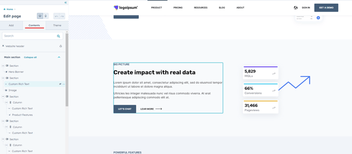
At the top of your sidebar, find the Edit for Mobile icon, which allows you to preview what your mobile users view. In this view, you can’t make changes to the content of your page, but you can tweak the styles of your page exclusively for mobile, including a visibility option that allows you to completely hide the content.
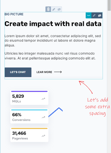
Example: Adding a Horizontal Spacer for Mobile.
Let’s say we want to add an extra space between a Custom Rich Text module and an Image module because we think the mobile view makes them stick too close together.
Our order of action would be:
- Adding a Horizontal Spacer module in the desktop view and adjusting styles.
- Hiding the Horizontal Spacer module for desktop view (hides for mobile as well by default).
- Switching to mobile view and making the module visible again (won’t affect desktop configuration)
