![kalungi logo black.svg]](https://help.kalungi.com/hubfs/HubSpot_Template_Marketplace/Turbo%20Mercuric/Logo/kalungi%20logo%20black.svg)
Considerations
Atlas Pro includes 2 ways to include tooltips. These tooltips can be used in any module that includes a rich text field (such as the Custom Rich Text module). We will give you a detailed view of how you should use the helper classes to generate the tooltips and how to modify/configure them. Keep in mind that a very basic HTML knowledge is required to add and configure them.
Icon based tooltips
Icon based tooltips are the most simple ones to use.
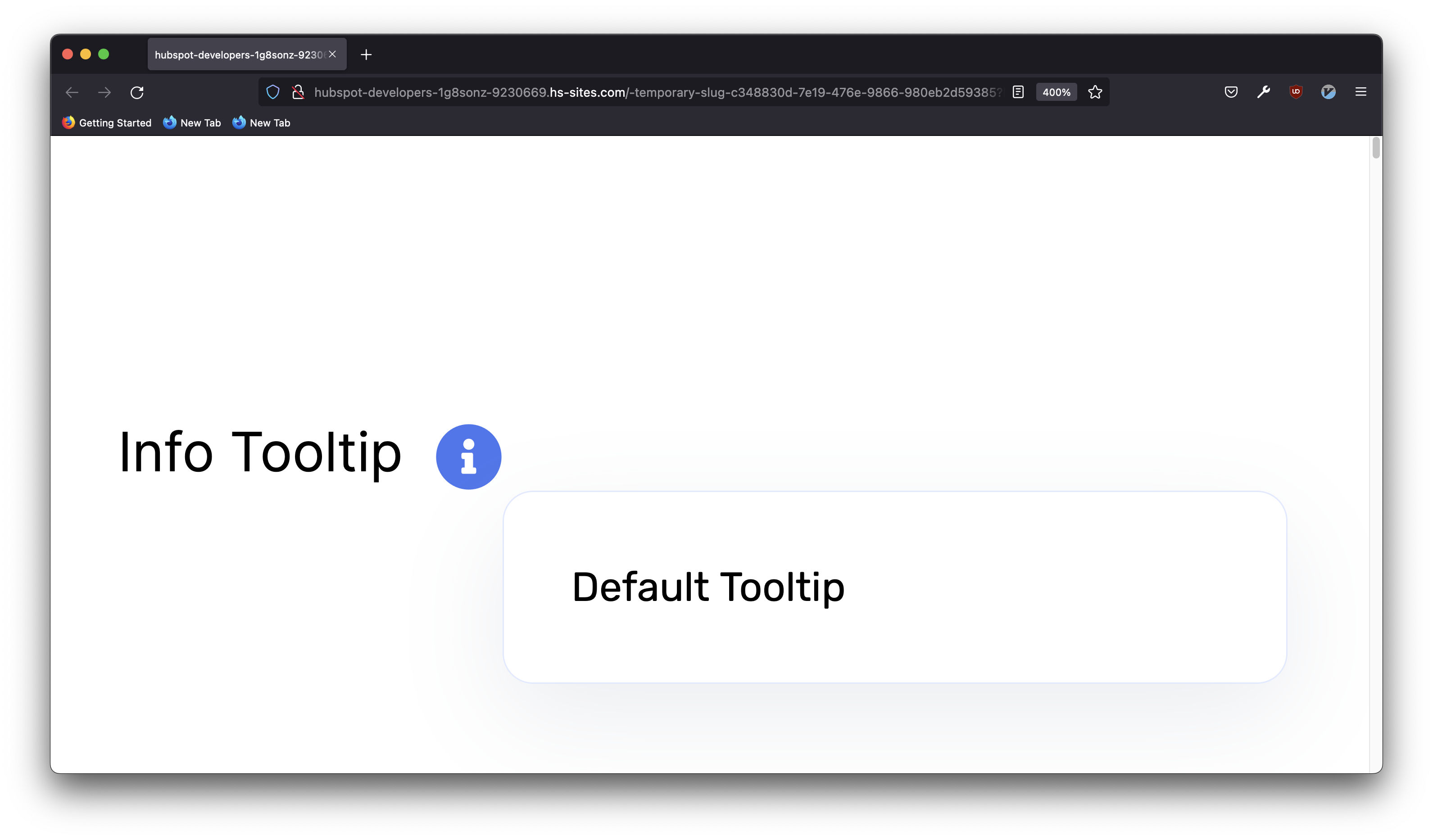
The easiest way to generate a tooltip is to use a span tag with the "kl-helper" class. This will generate a simple tooltip using the main color from the theme and an i icon. The text inside the span will be displayed inside of the tooltip.
<p>Info Tooltip
    <span class="kl-helper">
        Default Tooltip <!-- This will be the text that appears in the tooltip -->
    </span>
</p>
However, there are multiple ways to configure how the icon based tooltips will display. We have added specific classes that will allow you to control the color of the tooltip and the color of the icon displayed.
- The "info" class will display it with the default colors. This will also change the tooltip to inherit from the main color of the theme instead of white.
<p>Info Tooltip <span class="kl-helper info">Default Tooltip</span></p>

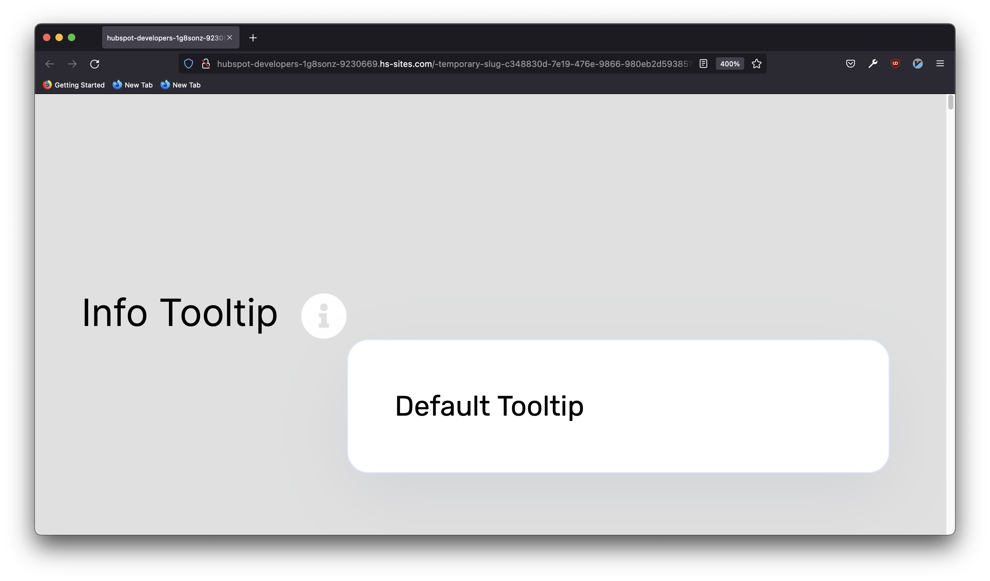
- The "info-dark" class will change the color of the icon to a dark tone but will keep the i. This will also change the color of the tooltip to a dark tone.
<p>Info Tooltip <span class="kl-helper info-dark">Default Tooltip</span></p>

- The "info-light" class will change the color of the icon to a light tone but will keep the i. This will also change the color of the tooltip to a light tone.
<p>Info Tooltip <span class="kl-helper info-light">Default Tooltip</span></p>
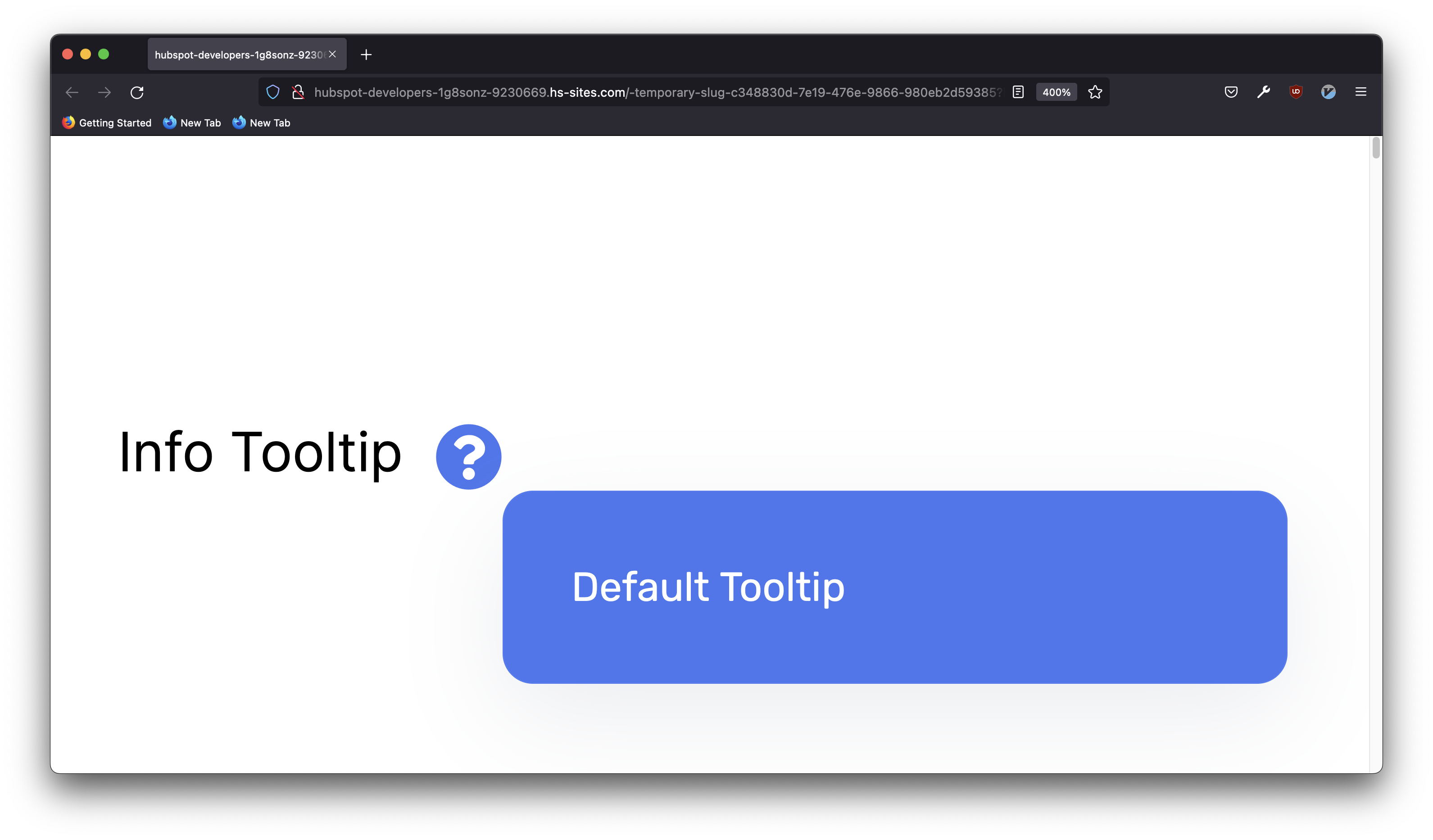
- The "question" class will display it with the default colors but will change the icon to a ? image instead.
<p>Info Tooltip <span class="kl-helper question">Default Tooltip</span></p>
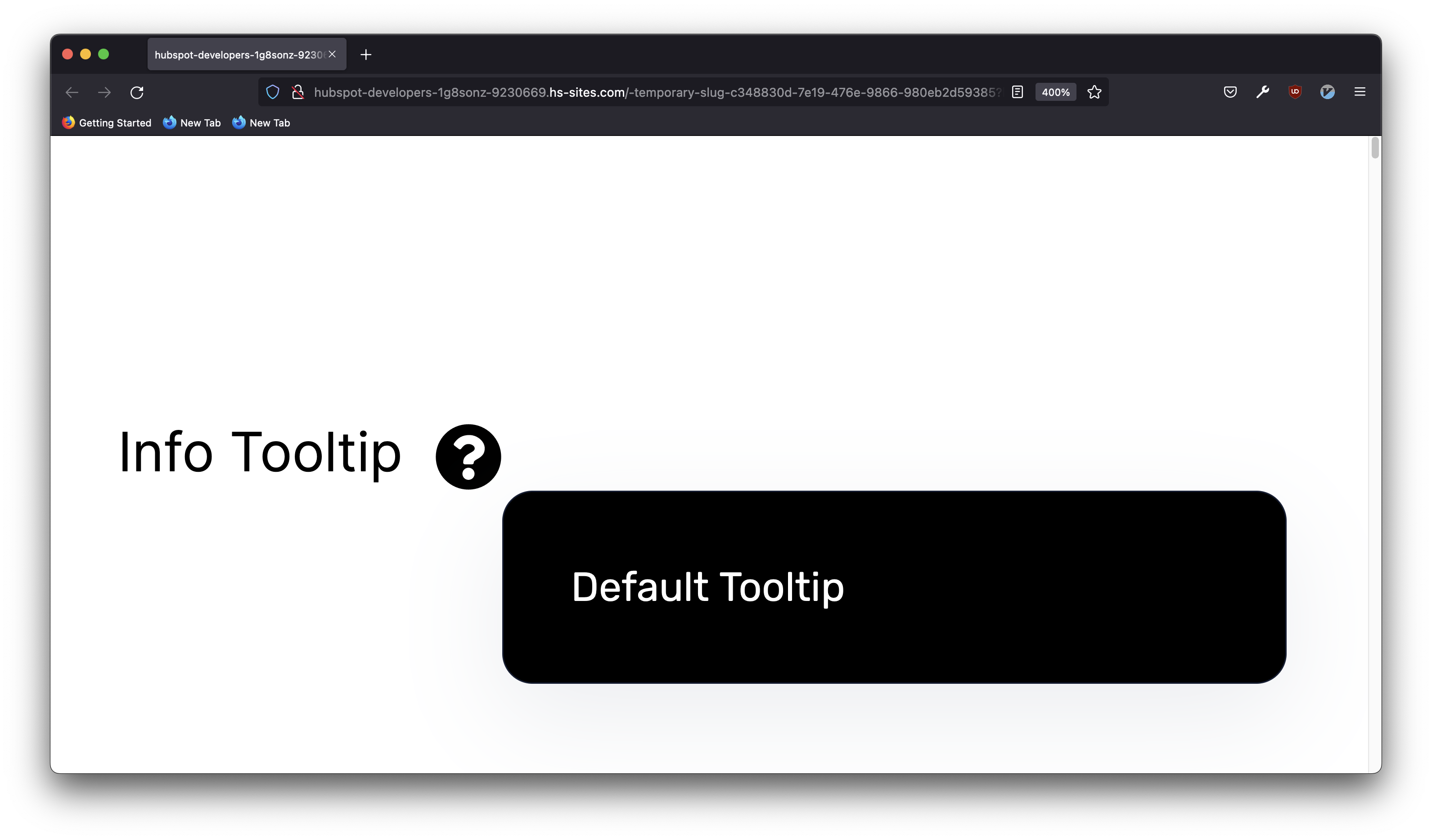
- The "question-dark" class will change the color of the icon to a dark tone and the icon to a ? image. This will also change the color of the tooltip to a dark tone.
<p>Info Tooltip <span class="kl-helper question-dark">Default Tooltip</span></p>
- The "question-light" class will change the color of the icon to a light tone and the icon to a ? image. This will also change the color of the tooltip to a light tone.
<p>Info Tooltip <span class="kl-helper question-light">Default Tooltip</span></p>
 This concludes the Icon based tooltips section.
Text based tooltips
Text based tooltips are a little more complicated, but will allow you to use Text instead of an image to trigger the tooltip.
The easiest way to generate a text based tooltip is to use 2 span tags.
The external one will need to have the "kl-helper" and "text" classes. This is where the text to trigger the tooltip will be.
The internal one doesn't need any classes (just the span tag). This is where the text inside of the tooltip will be.
This will generate a simple tooltip using the main color from the theme but will be triggered by hovering over the text instead of an image.
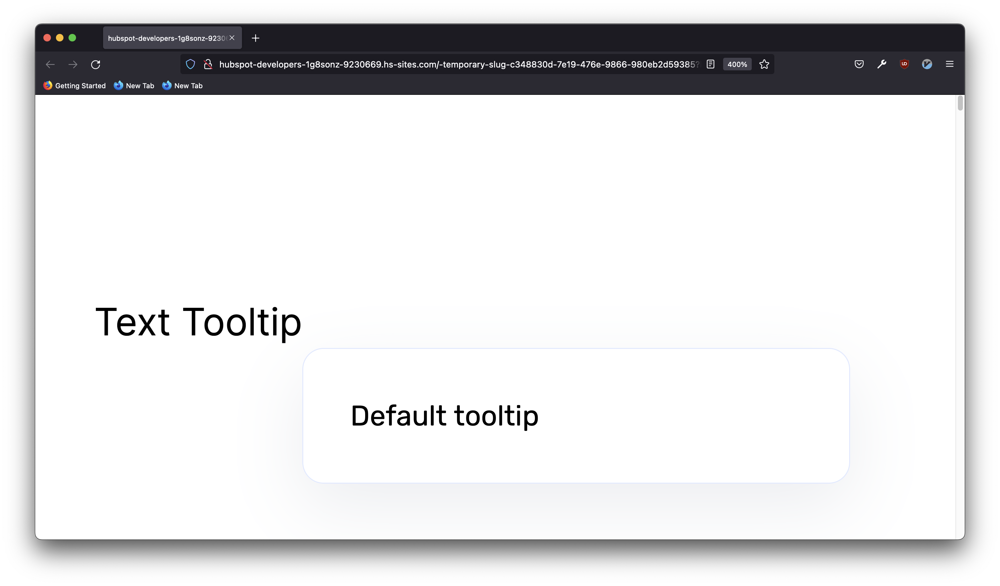
<span class="kl-helper text">
    Text Tooltip <!-- This will be the text that TRIGGERS the tooltip -->
    <span> Default tooltip </span> <!-- This will be the text that appears in the tooltip-->
</span>
Just like with the Icon based tooltips, there are specific classes that will allow you to control style of the text to trigger the tooltip and the color of the tooltip itself
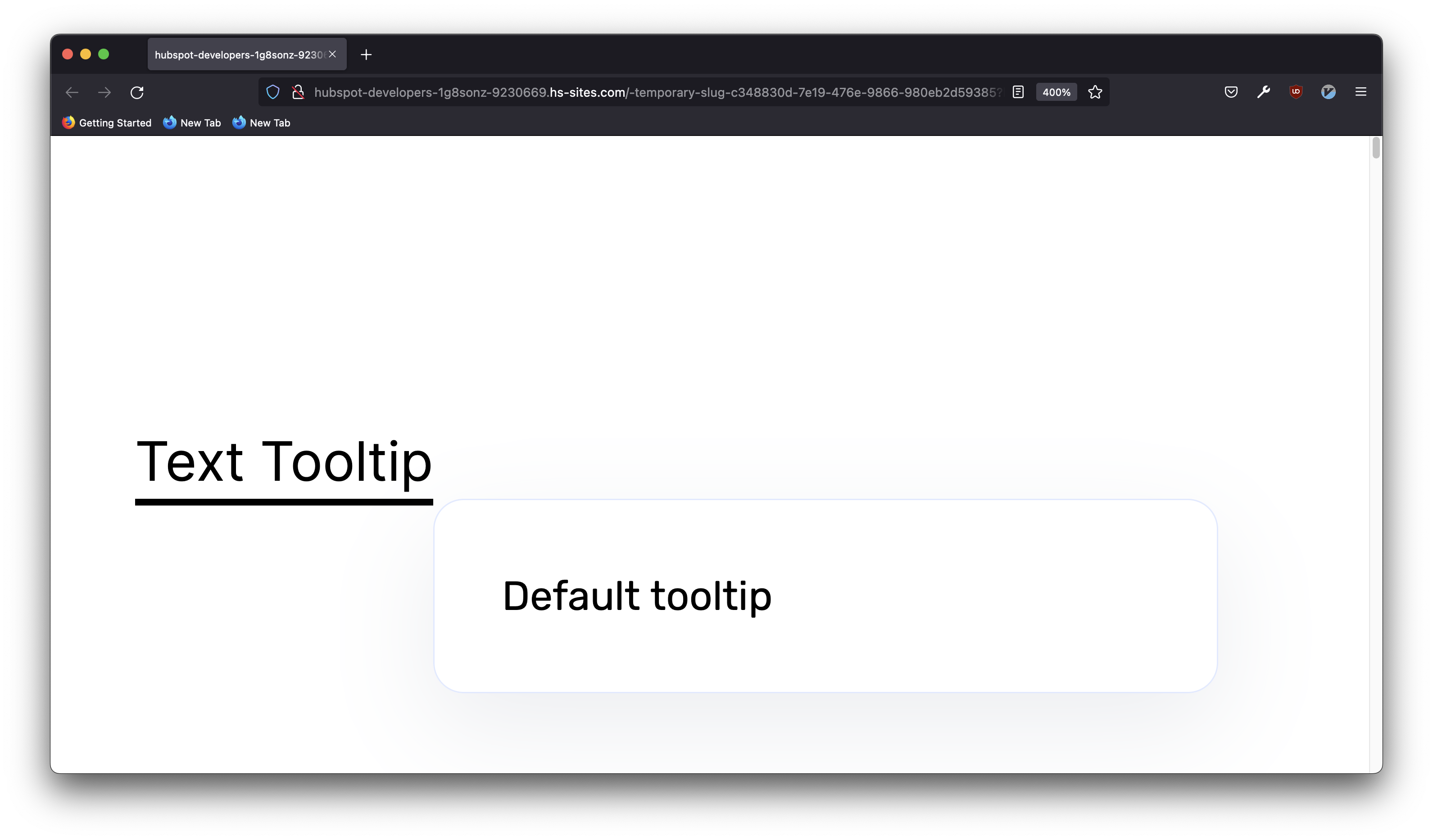
- The "underline" class will add an underline to the text that triggers the tooltip.
<span class="kl-helper text underline"> Text Tooltip<span> Default tooltip </span></span>
- The "dashed" class will add a dashed underline to the text that triggers the tooltip.
<span class="kl-helper text dashed"> Text Tooltip<span> Default tooltip </span></span>

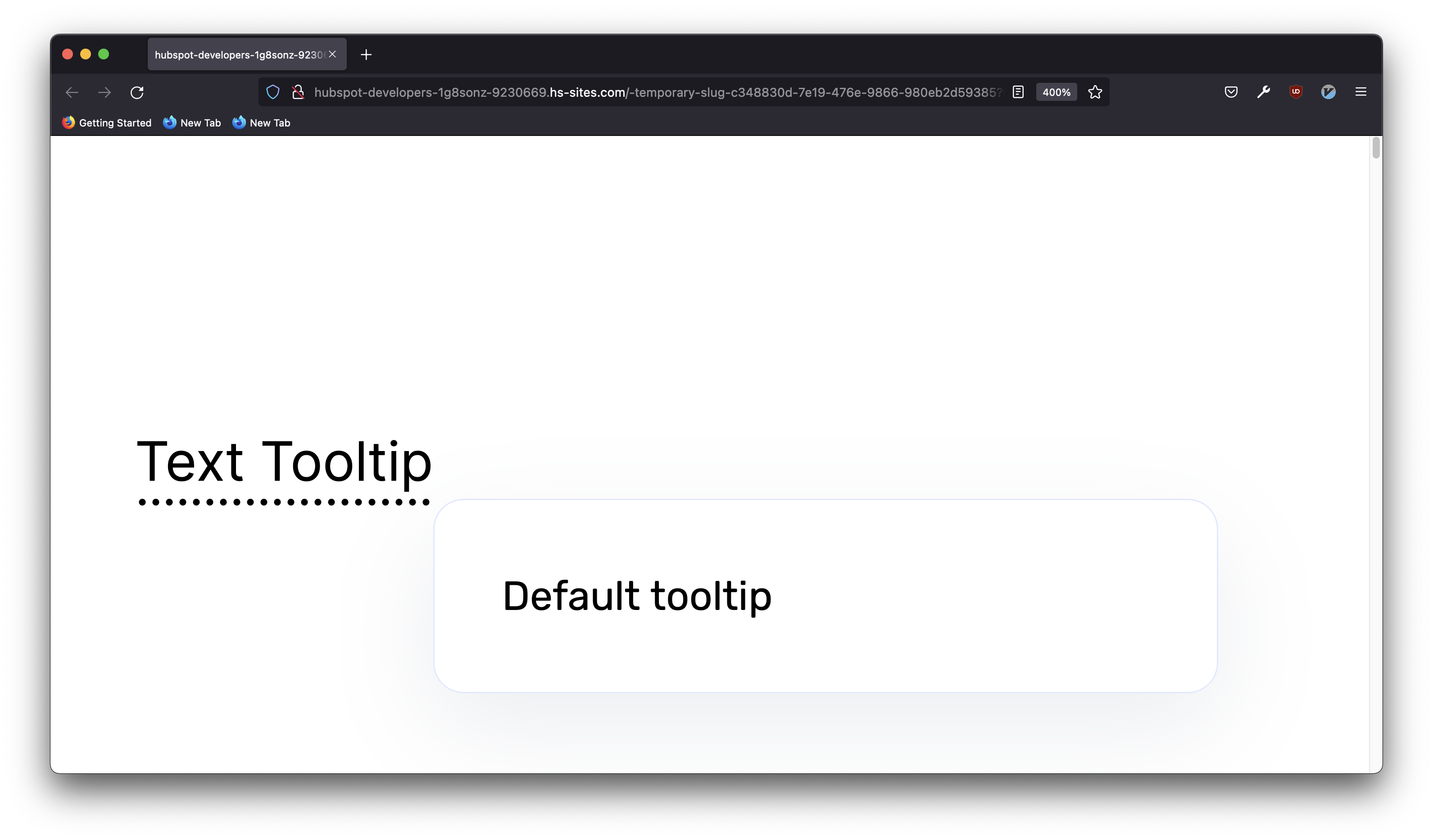
- The "dotted" class will add a dotted underline to the text that triggers the tooltip.
<span class="kl-helper text dotted"> Text Tooltip<span> Default tooltip </span></span>
- The "double" class will add a double underline to the text that triggers the tooltip.
<span class="kl-helper text double"> Text Tooltip<span> Default tooltip </span></span>

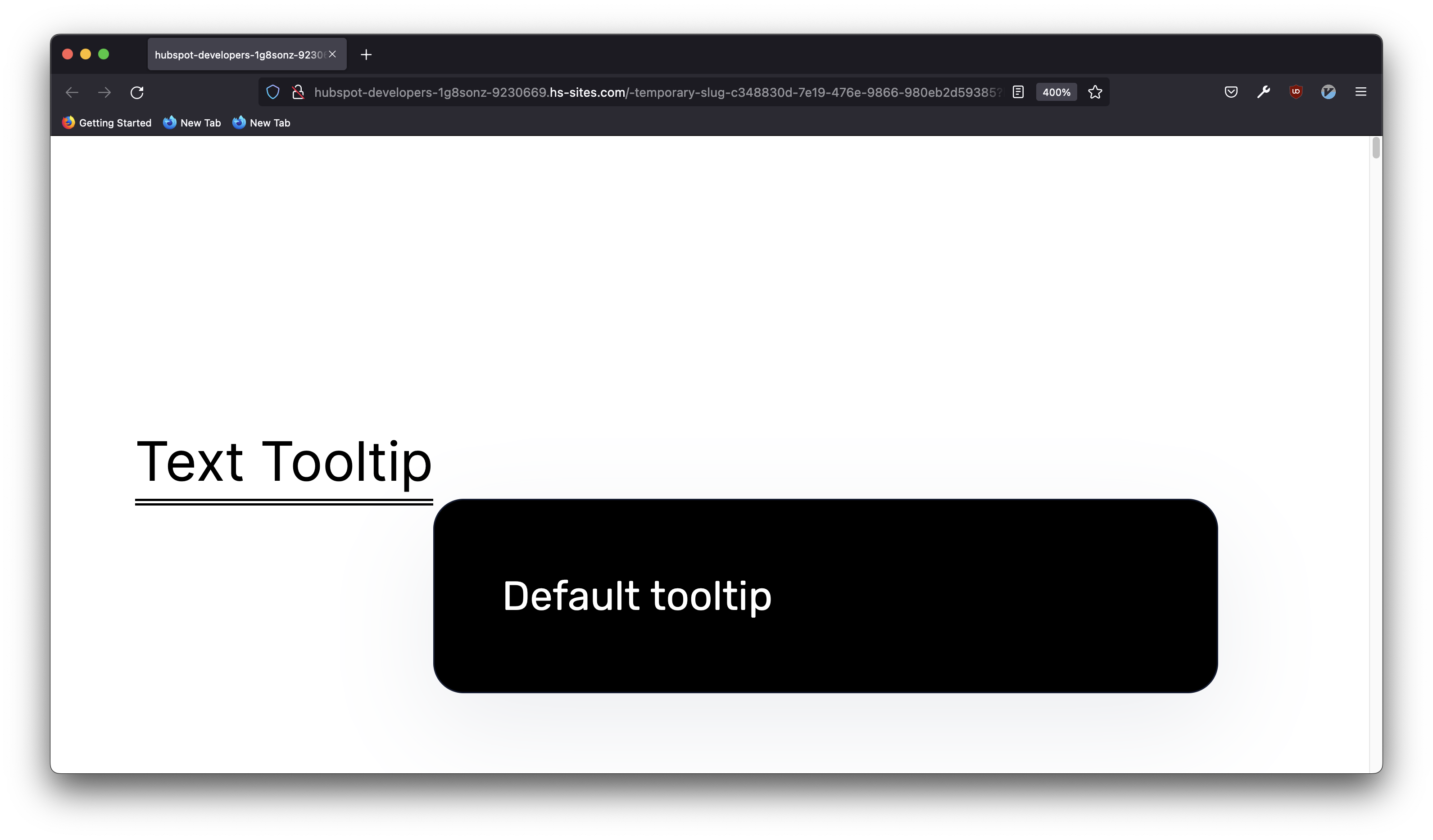
- You could also combine the text classes with the icon classes to change the tooltip color. For example, you can use the "info-dark" class to make the tooltip dark.
<span class="kl-helper text double info-dark"> Text Tooltip<span> Default tooltip </span></span>
This concludes the Text based tooltips section.
