Customizing the Global Header Content
Customizing the Global Header Content
The global header is where you can edit the website logo, navigation menu, the primary call to action, and the secondary call to action. To preview and edit the global header, we need to create a page if we haven’t yet. Check out this HubSpot article on how to create pages.
In this article, we’ll go over how to customize the content in the header. If you’d like to edit the navbar variant, background color, font, or header height, check out the global theme settings.
To access the website header content editor:
- Go to any website page that has the website header.
- Hover over the header and click Edit module.

3. Note that any change to the global header will affect all website pages. Click Open in global content editor.
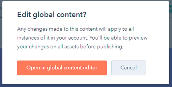
4. You are now editing the global header content.
By default, you will see the options for editing the Simple Navbar, but Atlas includes three header variants:
- Simple
- Mega Menu
- Drag and Drop
To change your navigation to the Mega Menu or Drag and Drop variants, you can do so from the Global Theme Settings. In this article, we’ll go over how to change the content of all three variants, but if you’d like to change the header’s settings, check out this separate article about the Global Theme Settings.
Before getting into the details of the variants, we’ll go over the settings that apply to all three types of navbars.
Logo
This group of settings allows you to add and customize your brand’s logo.
| Image |  |
This is your brand’s logo. We recommend using an image that either doesn’t have a background, or that has a static background color that you can match with the Background Color setting available in the global Theme Settings. |
| Alt Text |  |
The alt is the written copy that appears in place of an image on a webpage if the image fails to load. It also serves as a description of the content for users that use text-to-speech. |
| Size |  |
The image size can be automatically adjusted to fit in all resolutions. You can also set it to an exact width and height. |
| Maximum Size |  |
The image size can be automatically adjusted to fit in all resolutions. You can also set it to an exact width and height. |
| Type |  |
This setting sets the link that the user gets redirected to when clicking your logo. Setting it to Custom Link allows you to set an Href |
| Href |  |
The Href field that can point to either a anchor or external webiste. Setting it to HubSpot Link allows you to select a Page, Blog Post, Blog Listing Page, or any kind of content that lives within your HubSpot account. |
Primary and Secondary CTAs
Your primary Call to Action button is meant to encourage the most desired action you want visitors to take. Your secondary Call to Action button provides an alternative action for the users to take. Both of them have the same customization options.
| Type |  |
You can choose between a customizable button, a HubSpot CTA, or no button at all. |
| Style |  |
Atlas offers three styling options for your buttons: Filled, Outlined, and Arrow. These styles follow the listed order of hierarchy. |
| Text |  |
A text that describes the action to be triggered. |
| Type |  |
This setting sets the link that the user gets redirected to when clicking your logo. Setting it to Custom Link allows you to set a Href that can point to either a anchor or external webiste. Setting it to HubSpot Link allows you to select a Page, Blog Post, Blog Listing Page, or any kind of content that lives within your HubSpot account. |
Simple Navbar
The Simple variant is the classic navbar view. You can configure your logo and navigation buttons with dropdowns that show when hovering over them.

To customize your navigation menu, click the Edit menu content button. The content editor allows you to edit the text children and links of every navigation button.
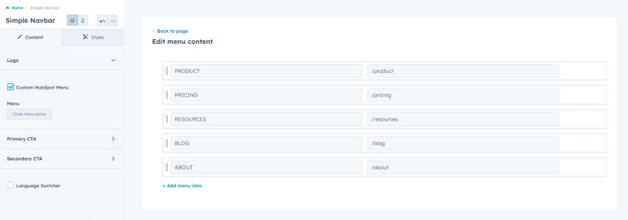
Hovering with the cursor over an item will show the Actions dropdown. Select the Add child item below option.
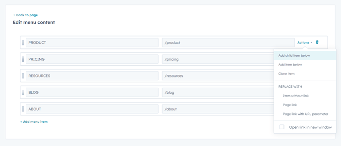
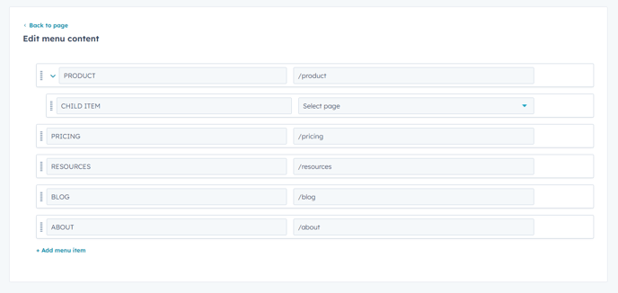
This will create a new child item that can be found within its parent dropdown menu. Your child items can have child items as well, allowing for deeper categorizations.

Mega Menu
The Mega Menu variant makes those hover dropdowns become mega hover dropdowns! It’s great for showing some detailed information about the children of each navigation button.

When editing the Mega Menu, all your navigation buttons will be listed under the Menu label. Here, you can organize, delete, add, or edit your buttons. Let’s go ahead and edit one of them.
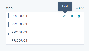
Once in the button configuration, you will be able to change the button’s title, description, type of link, and children elements.
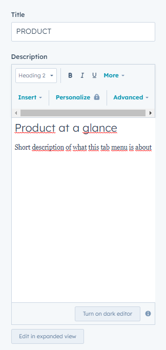
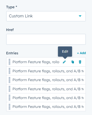
The children’s elements can be edited through a highly customizable rich text field. You can also select the type of link the user gets redirected to when clicking on them.
Drag and Drop
The Drag and Drop variant allows you to customize your header with any module, just like any drag and drop you might find in the page editors.

When editing the Drag and Drop variant, you will be presented with a list of all available modules. You can hold left-click over any module and drag it to the header.

