![kalungi logo black.svg]](https://help.kalungi.com/hubfs/HubSpot_Template_Marketplace/Turbo%20Mercuric/Logo/kalungi%20logo%20black.svg)
With your theme settings, you will be able to modify:
- Global colors
- Global fonts
- Website header
- Typography
- Buttons
- Forms
- Tables
- Cards
- Spacing
- Footer
- Blog
To get familiarized with the different types of website elements , check out our styling guide.
To Access the Global Theme Settings:
- Use the gear icon at the top right of your screen to go to Settings, then scroll down the navigation column to access Website ⇒ Themes.
- Click the View Theme button that shows when hovering over the child theme you created.
- Feel free to explore the setting to find what best suits your branding. Your changes are previewed for your convenience.
- Use the Publish to assets button to make these changes take place in all of the pages and blogs you´ve created and to make this setting a default for future pages and blogs.
Here’s a quick video on different ways to access the theme settings.
Global Colors
Colors are fundamental to your brand. With this setting group, we can make them consistent throughout your site.
| Primary Color | 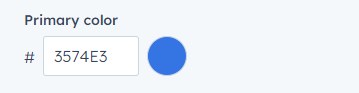 |
The primary color sets the accent tone of your brand. Call to Action buttons, labels, pre-headings, and anything that should be highlighted will use this color. |
| Secondary Color | 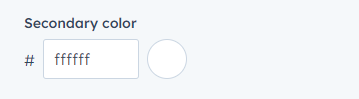 |
The secondary color is used when highlighting anything next to the primary in the relevance hierarchy. |
| Text Color | 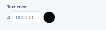 |
The color of all headings and paragraphs across your site. |
Global Fonts
Fonts can set the tone of your site. We recommend fonts that complement each other and have the same structure. Using font weights for hierarchy instead of multiple font families will ensure consistency. You can also override the Text Color setting we’ve previously set for each font.
| Primary Font | 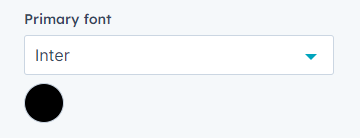 |
The primary font will be used for all text, labels, and call to action buttons. |
| Secondary Font | 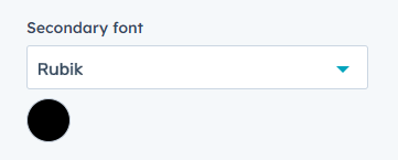 |
The secondary font will be used for titles, headings, and preheadings. |
Website header
The website header will serve as a navigation tool throughout your website.
| Navbar Module Variant | 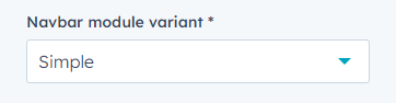 |
Atlas includes three types of navbars: Simple, Mega Menu and Drag and Drop. These variations include multiple fetures and cofigurations, listed below. |
| Background Color | 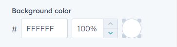 |
The background color setting can be set with the color picker or with a hex color code alongside the transparency, expressed in percentages. |
| Menu Link Font | 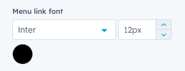 |
The Menu Link Font setting can overwrite the general font, text color, and font size (expressed in pixels) for the navigation buttons. |
| Navbar Height | 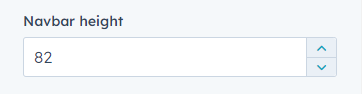 |
The Navbar Height setting allows you to express an exact height in pixels. |
Navbar Module Variant: Simple
The Simple variant is the classic navbar view. You can configure your logo and navigation buttons with dropdowns that show when a user hovers over them.

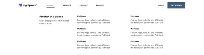
Navbar Module Variant: Mega Menu
The Mega Menu variant makes those hover dropdowns become mega hover dropdowns! It’s great for showing detailed information about each navigation button's children.
Navbar Module Variant: Drag and Drop
The Drag and Drop variant allows you to customize your header with any module, just like any drag and drop you might find in the page editors.

To learn more about how you can change the contents of your Navbar module, make sure to check this article on how to customize the global header content.
Typography
You can set specific colors, fonts, and font sizes for each type of text.
Headings represent different types of titles with different hierarchy levels. Use them to your advantage to properly define sections and content relevance.
| Body Text | 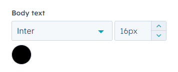 |
This setting will affect all paragraphs and text, excluding headings. |
| Body Line Height | 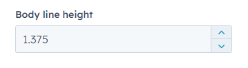 |
This setting specifies a multiplier for the default space between lines in a body text. |
| Preheader | 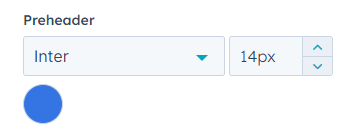 |
Preheaders are used in multiple modules, usually as labels or as an introduction that leads to a heading. |
| Heading One (H1) | 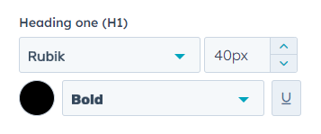 |
Heading of the highest heriarchy level. All pages should have exactly one Heading 1. |
| Heading Two (H2) | 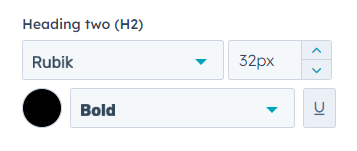 |
Second heading in the heriarchy level. Use to define secitions on your page. |
| Heading Three (H3) | 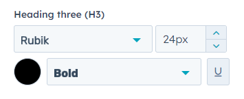 |
Third heading in the heriarchy level. Use to define stucture inside your sections. |
| Heading Four (H4) | 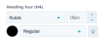 |
Fourth heading in the heriarchy level. Use to define stucture inside your sections. |
| Heading Five (H5) | 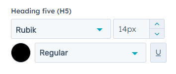 |
Fifth heading in the heriarchy level. Use to define stucture inside your sections. |
| Heading Six (H6) | 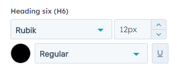 |
Sixth heading in the heriarchy level. Use to define stucture inside your sections. |
| Link Color | 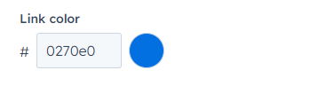 |
This setting will affect the color of every inserted link or anchor that you set across your site. |
| Enable Responsive Typography |  |
This checkbox allows you to set a new set of settings that will only apply to mobile devices. |
Buttons
This section allows you to adjust all of your Call to Action buttons, overriding any other styling settings.
| Background Color | 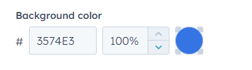 |
Use this setting to pick a color for your button. It’s recommended to pick a color that matches your brand’s accent colors. The background color setting can be set with the color picker or with a hex color code alongside the transparency, expressed in percentages. |
| Text Color | 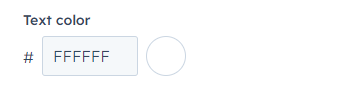 |
Use this setting to change the color of the text that labels your button. Use a color that has a high contrast ratio against the background color. |
| Font | 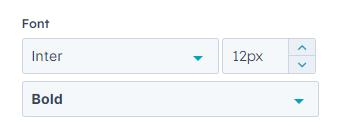 |
Use this setting to change the font family, size, and weight of your buttons’ text. |
| Text Case | 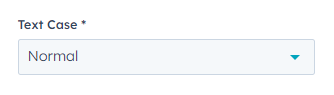 |
Use this setting to choose between normal, upper, lower, and title cases. This will automatically override your button’s text capitalization. |
| Border | 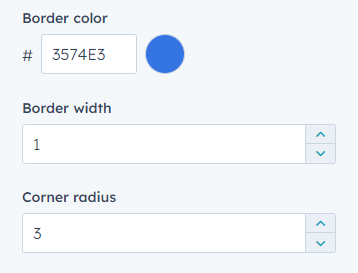 |
Use this setting group to change the border color, border width, and corner radius. The border width and border radius are expressed in pixels. It’s recommended to be consistent with the corner radius value across boxes on your site. |
| Padding | 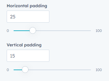 |
The padding is the space between the text and the borders of your button. You can set independent values for horizontal and vertical padding. |
| Hover | 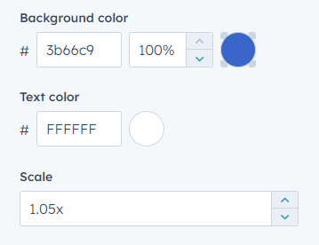 |
Hovering happens when a user lays the cursor above an element. With this group of settings, you can change your button's background color, text color, and size when a user hovers their cursor above your it. You usually want to keep your hovering colors to similar shades of static colors. |
Forms
Forms are a very powerful way to know your users. Use color palettes that match your branding and draw your users’ attention. The colors can be set with the color picker or with a hex color code.
| Header Text Color | 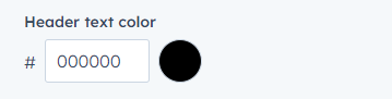 |
Use this setting to pick a color for the main title of your form. |
| Label Color | 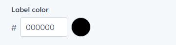 |
Use this setting to pick a color for the label that shows above your input fields. |
| Help Text Color | 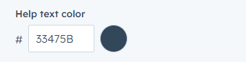 |
Use this setting to pick a color for the tooltip label that can be configured in the form editor. |
| Field Border Color | 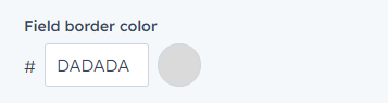 |
Use this setting to pick a color for the borders of all your input fields. |
| Field Focus Border Color | 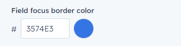 |
Use this setting to pick a color for the borders of focused input fields. An input field gets focused when a user is editing said field. |
Tables
Tables allow you to showcase and compare information. Use color palettes that match your branding and draw your users’ attention. The colors can be set with the color picker or with a hex color code alongside the transparency, expressed in percentages.
| Header Background Color | 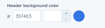 |
Sets the background color of your table’s header row. This section usually serves the purpose of labeling columns. |
| Header Text Color | 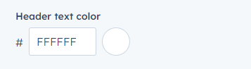 |
Sets the text color of your table’s header row. This section usually serves the purpose of labeling columns. |
| Body Background Color | 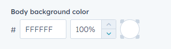 |
Sets the background color of your table’s main body cells. |
| Body Text Color | 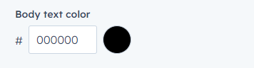 |
Sets the text color of your table’s main body cells. |
| Footer Background Color |  |
Sets the background color of your table’s footer row. This section is usually used for summarizing or concluding a column’s content. |
| Footer Text Color |  |
Sets the text color of your table’s header cells. This section is usually used for summarizing or concluding a column’s content. |
| Border Color |  |
Sets the color of all the borders on your table. |
Cards
Cards are used in multiple modules as a simple stylized boxed container. These settings will reflect on all modules that use any type of card.
| Background Color |  |
The background color setting can be set with the color picker or with a hex color code alongside the transparency, expressed in percentages. |
| Border Color | 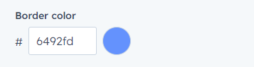 |
The border color setting can be set with the color picker or with a hex color code. It’s recommended to use either a similar shade of your primary color or a similar shade of the card’s background color. |
| Box Shadow Color | 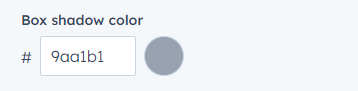 |
Use this setting to customize a highlighted card’s shadow color. Cards highlight when hovering over them. Some modules, such as the Pricing Card module, allow you to keep a card highlighted at all times. |
| Box Shadow Light Color | 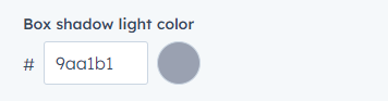 |
Use this setting to customize a card’s shadow color. |
| Border Radius | 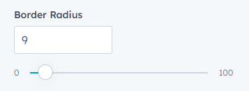 |
Use this setting to change the border radius, either using the text input or the slider input. It’s recommended to be consistent with the border-radius value across boxes on your site. |
Spacing
The spacing settings are set to all Sections by default. These settings can be overwritten within any section.
| Vertical Spacing | 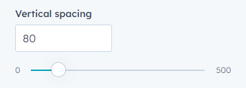 |
The vertical space between the content and the border of your section. It’s expressed in pixels. |
| Maximum Content Width | 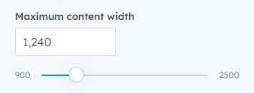 |
The width of a section responds to the user’s screen resolution, but your content is prone to lose its structure if stretched too much. With this setting, you can limit the width of your content within a section. The value is expressed in pixels. |
Footer
Your footer will summarize relevant information about your site.
| Footer Module Variant | 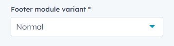 |
Atlas includes three types of footers: Normal, Simple, and Drag and Drop. These variations include multiple features and cofiurations, listed below. |
| Background Color | 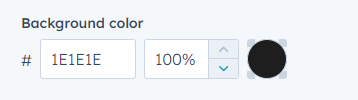 |
The background color setting can be set with the color picker or with a hex color code, alongside the transparency, expressed in percentages. |
| Hide Byline |  |
This Atlas Pro exclusive setting hides the "Atlas by Kalungi" label from the footer. |
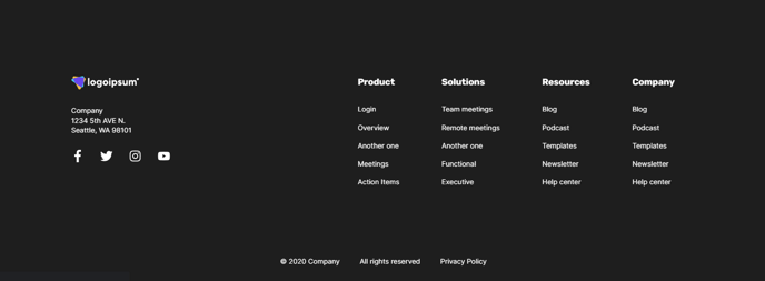
Footer Module Variant: Normal
The Normal variant is the classic footer view. You can configure your logo, navigation, contact information, and more.
Footer Module Variant: Simple
The Simple variant is a minimized version of your footer.
Footer Module Variant: Drag and Drop
The Drag and Drop variant allows you to customize your header with any module, just like any drag and drop you might find in the page editors.

To learn more about how you can change the contents of your Footer module, make sure to check this article on how to customize the global footer content.
Blog
With this group of settings, you can customize your Blog Listing Pages.
| Header Image | 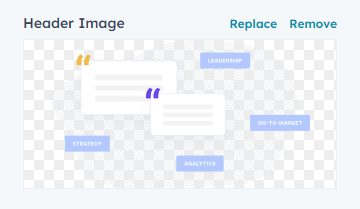 |
This image will show on all of your listing pages. We recommend using images that either don’t have a background or that have a static background color that you can match with the Background Color setting. For performance reasons, try to keep your image size below 200Kb and use the recommended .webp format. |
| Alt Text | 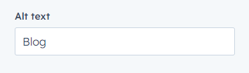 |
The alt is the written copy that appears in place of an image on a webpage if the image fails to load. It also serves as a description of the content for users that use text-to-speech. For SEO purposes, try to keep it descriptive. |
| Size | 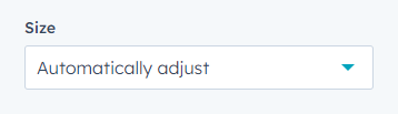 |
The image size can be automatically adjusted to fit in all resolutions. You can also set it to an exact width and height. |
| Maximum Size | 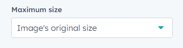 |
This setting is set by default as the image’s original size to prevent it from rendering in sizes that will decrease quality. You can also set it to an exact width and height. |
| Background Color | 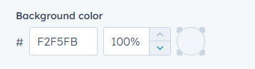 |
The header’s background color setting can be set with the color picker or with a hex color code alongside the transparency, expressed in percentages. |
| Tag Limit | 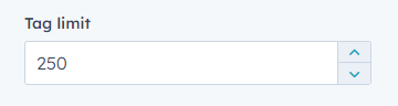 |
The Blog Listing Page lists all of your Blog Posts' tags. You can limit the number of listed tags. |
| Show Summary in Blog Post | 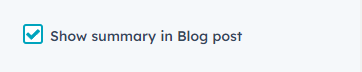 |
Your Blog Post Template includes a description of your post’s content, which is pulled directly from the meta description. You can enable or disable this description with this field. |
Scroll Behaviour
The scrolling behavior can be set to two options: Auto or Smooth. It affects the automatic scrolling that happens when a user is directed to a page section through an anchor.
|
Scroll Behaviour |
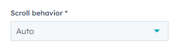 |
The Auto option sets the browser's default, which generally is set to scroll the user instantly to the targeted section. The Smooth option enables a scrolling transition similar to the user's mouse or touch scroll. |
